In-process print inspections help catch errors early, reducing defects and saving costs. Here’s what you need to know:
- Why It Matters: Quality issues can cost up to 20% of sales revenue. A $50M business could lose $10M due to defects.
- Key Focus Areas:
- Visual Checks: Ensure color accuracy, alignment, and surface quality.
- Dimensional Checks: Verify trim size, margins, and registration for precise output.
- Substrate Inspection: Assess materials for defects before and during production.
- Color Consistency: Monitor for shifts in hues and ensure ink adhesion.
- Final Inspection: Catch surface defects before shipping.
Pro Tip: Use digital tools for real-time tracking, photo documentation, and streamlined reporting. Early detection saves time and money while maintaining high-quality standards.
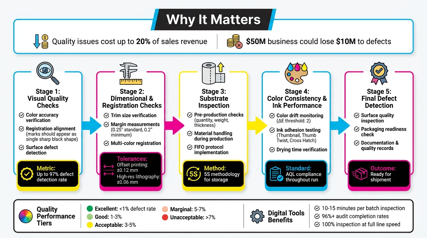
5-Stage In-Process Print Inspection Checklist with Key Metrics
How Camera Inspection in Printing Works
sbb-itb-ce53437
Visual Quality Checks
Visual inspections play a crucial role in identifying defects early by ensuring that prints align with design specifications and meet customer expectations. As Unitek Technical Services explains:
"Our visual inspection checks for defects, marks, missing objects and foreign object damage to ensure the product is conformal before it leaves production".
Color Accuracy and Consistency
Ensuring accurate and consistent color requires adherence to Acceptable Quality Level (AQL) standards and pre-established color benchmarks. Operators should rely on calibrated tools to compare prints against reference samples throughout production. Techniques like shade segregation help manage color variations between batches, ensuring consistent hues and saturation levels.
Digital checklists, accessible via mobile devices, allow inspectors to take real-time photos of prints, creating a traceable record for comparing approved samples with current outputs. Routine random sampling can catch early signs of color drift, minimizing rework costs. After verifying color, it’s essential to confirm alignment using registration marks.
Registration Alignment
After confirming color accuracy, inspectors should check registration marks to ensure proper alignment. These marks – small crosshairs or grids printed in trim areas – are designed to reveal alignment issues instantly. Since registration marks use 100% of all ink colors, they should appear as a single, sharp black shape when aligned correctly. Misalignment is evident when cyan, magenta, or yellow fringes appear around the mark. As Color Vision Printing puts it:
"Precise registration is a prerequisite for high-quality printing".
Inspectors should also look for signs like fuzzy or blurred text, halo effects around objects, or unprinted gaps where color is expected. Registration checks should extend beyond ink alignment to include finishing details such as foil stamping, embossing, die-cuts, and spot UV coatings. For carbonless forms, ensure that printed fields on the top ply align perfectly with fields on subsequent plies to guarantee accurate data transfer. These checks help maintain the integrity of finishing features and overall print quality.
Surface Defects and Ink Coverage
Surface inspections are key to spotting marks, missing elements, or foreign object damage that could compromise print quality. Detecting issues like smudging, streaking, or uneven ink coverage early prevents hidden defects from escalating. Digital tools can document any surface damage, facilitating clear communication with management. As Operations1 highlights:
"Digital checklists shed light on the black box of incoming goods… [and] ensure that everything is documented in a legally compliant and error-free manner".
Focusing on high-risk areas during surface inspections can significantly reduce the need for rework.
Dimensional and Registration Checks
Precision goes beyond just visual inspections – it requires exact dimensional and registration measurements to meet customer expectations. Dimensional checks ensure that products align with specifications by using calibrated tools. As Unitek Technical Services explains:
"Our in-process inspection goal is to measure and confirm a component’s critical characteristics to ensure a seamless production process and to eliminate potentials for rework."
Identifying issues early can significantly reduce rework costs. Operators should combine visual and dimensional inspections to catch surface flaws and measurement discrepancies simultaneously. This dual approach ensures consistent print quality.
Trim Size and Margins
Accurate trim size and margin measurements are crucial. Calibrated rulers or digital calipers are often used to confirm that prints are within job specifications. For MICR check printing, margins typically measure 0.25 inches on portrait orientation, allowing for an 8-inch printable width. If these standard margins limit the print area, they can be adjusted to 0.2 inches (5 mm) in the print setup software.
Test print validation is a practical method for ensuring dimensions are correct. For example, Cast and Crew employs test printing for MICR checks on 8.5″ × 11″ blank check stock. Their process involves printing a sample check and submitting it to the bank for approval. Production only begins once the bank confirms the test check’s dimensions and alignment. For layouts requiring precise positioning – such as checks where the negotiable portion must sit in the lower third of the page – operators should compare placement against physical templates both during setup and periodically throughout production.
Multi-Color Registration
Ensuring accurate multi-color alignment is just as critical as verifying dimensions. Misaligned colors can lead to visible fringing or gaps between ink layers. For offset printing, the standard registration tolerance is ±0.12 mm, while high-resolution lithography demands tighter tolerances, often around ±0.06 mm. Since registration errors are often non-linear, inspectors should examine all four corners and the center of each sheet.
To prevent substrate shifting during multi-pass runs, maintaining consistent web tension and using sheet-alignment systems is essential. Plates should be mounted with alignment pins and calibrated gauges for precise repeatability. Many modern presses now feature Automatic Register Control (ARC) systems, which use optical sensors to make micro-adjustments during production.
For added accuracy, test a 1–2 inch strip with registration marks under magnification. Ensure the RIP is set to 1:1 scaling with the "register check" feature enabled. Climate-controlled environments are also critical for maintaining registration stability during production.
Substrate and Material Inspection
The quality of your printed output starts with the condition of your substrate – long before it reaches the press. Beyond dimensional and visual checks, the substrate’s condition plays a key role in ensuring consistent print quality. Inspecting materials as soon as they arrive not only keeps your production schedule on track but also protects your rights under supplier warranties. In fact, some commercial codes state that failing to inspect materials promptly could forfeit your ability to claim damages for defective goods. As Operations1 explains:
"The incoming goods inspection is important for determining whether a delivery corresponds to the initial order placed in terms of quantity and quality."
Pre-Production Substrate Checks
Before production begins, confirm that your substrate meets all order specifications, such as quantity, weight, count, trim size, and thickness. Use calibrated tools and visual inspections to identify any surface defects, dust, foreign object damage, or moisture that might affect ink adhesion.
If any defects are found, work with suppliers to document them for potential warranty claims. For specialized materials like fabric, additional steps such as shrinkage testing and shade segregation can help prevent issues like color inconsistencies.
Also, double-check shipping documents and packing lists for accuracy. Implement FIFO (First In, First Out) protocols to ensure materials are used before they degrade. Once these checks are complete, safeguarding the substrate throughout production becomes the next priority.
Material Handling During Production
Proper material handling during production builds on pre-production checks to maintain substrate quality throughout the printing process. Continuously monitor for issues such as wrinkles, tears, or environmental damage that could compromise the substrate. Use 5S methodology in storage areas to minimize contamination risks, especially for sensitive materials.
Be aware of "hidden defects" that might only emerge during printing, such as internal inconsistencies or moisture problems that disrupt ink performance. Real-time reporting systems can help you detect and address these issues immediately, reducing waste and avoiding costly rework. Additionally, integrating sensors with digital systems to automatically track substrate values can improve traceability and reduce manual errors. This kind of proactive monitoring ensures that errors don’t snowball into larger problems, preserving the quality of your final output.
Color Consistency and Ink Performance
At Miro Printing & Graphics Inc., keeping colors consistent throughout a print run is a key focus. Even with careful preparation, colors can shift during production, and ink performance issues can pop up unexpectedly. By monitoring these factors in real time, you can avoid waste and ensure every piece meets the approved quality standards.
Color Drift Monitoring
Color drift happens when hues gradually change during production. This can be caused by things like variations in ink flow, temperature changes, or differences in the substrate between batches. To catch these shifts early, conduct visual inspections throughout the run, comparing against established color standards and Acceptable Quality Levels (AQL) [1, 2]. As Millcraft points out, "Colors often appear differently depending on the medium, lighting, and viewing conditions". For accurate inspections, always use lighting conditions that match how the final product will be viewed.
Using shade segregation is another way to track variations, especially during long runs. If you notice drift, record it immediately using digital checklists with real-time updates. This approach helps you address the issue before hundreds of sheets are affected [2, 6]. Integrating sensors and scanners with your quality management system can also provide objective color measurements, reducing the chance of human error. Once you identify a drift, implement corrective and preventive actions (CAPA) to adjust press settings and bring the output back to spec.
To document issues thoroughly, take photos of any color variations and attach them to inspection reports. This creates a clear record for addressing problems and improves communication between inspection points and the production floor, helping to minimize the amount of off-color material.
Ink Adhesion and Drying Time
Good ink adhesion is critical to avoid problems like peeling, blistering, or smudging. Ink bonds to substrates in different ways: through absorption in porous materials, chemical bonding when solvents soften the surface, or mechanical interlocking via surface wetting. Testing adhesion during production ensures the bond will hold once the job is complete.
A simple way to check adhesion is the Thumbnail Test – scratch the cured ink surface with your thumbnail. According to Jim Hingst of Nekoosa, "A properly cured ink will resist scratching". Another option is the Thumb Twist Test: press your thumb into the ink and twist it. Hingst explains, "If the ink is not thoroughly cured, a hardened layer of ink can slip over an uncured layer. A properly cured coating also should not feel tacky".
For more precise results, use the Cross Hatch Test. This involves scoring 11 parallel lines and 11 perpendicular lines into the ink to create a grid with 1/8-inch spacing. Apply aggressive tape (like 3M Brand #600), press it down with a squeegee, and pull it off quickly at a 180° angle. If any ink comes off, adhesion is insufficient. While professional cross hatch testers can cost $500–$600, a simple knife and tape are often enough for routine checks.
Always perform these tests using the same curing methods planned for full production to get accurate results. Keep detailed records of the variables and materials used for each job to ensure consistency for future reorders. As Hingst notes, "The importance of adhesion testing is to determine the strength of the bond before the job leaves your shop. That way you avoid the embarrassment when a job fails".
Final Print Defect Detection
The final inspection is the last opportunity to identify defects before products are finished or shipped. This step is critical for catching surface issues that could lead to costly returns or warranty claims. It builds on earlier inspections to ensure no problems slip through before the product moves forward.
Surface Quality Inspection
Surface quality inspection requires a detailed visual review to catch scratches, ink transfers, marks, or any foreign object damage. This is the last chance to confirm the product meets standards before leaving production. Inspect for more subtle issues as well, such as wear, corrosion, or incomplete ink coverage that may have gone unnoticed during earlier checks.
Proper lighting plays a key role in spotting these issues. Ensure the inspection area is well-lit to reveal faint scratches or slight color variations. Digital inspection tools can be incredibly effective, with some systems reporting a 97% success rate in identifying manufacturing defects.
Additionally, maintain a clean and organized workspace to avoid contamination of finished prints. Be attentive to any unusual odors or leaks, as these could point to chemical contamination or ink drying problems.
Once surface issues are resolved, confirm that all prints are ready for shipment.
Packaging Readiness Check
Before packaging, ensure that prints meet both quality and quantity standards. Cross-check the finished prints against packing lists and delivery bills to verify they match the order. Confirm that all labels and warning signs are clear and correctly applied. Any product that fails to meet standards should be quarantined immediately to prevent accidental shipping.
When defects are found, document them promptly with photographs. This visual record supports corrective actions and can serve as evidence if supplier complaints or customer concerns arise. Use digital checklists to log findings whenever possible. As Operations1 explains:
"Digital checklists shed light on the black box of incoming goods… ensuring that everything is documented in a legally compliant and error-free manner".
For added accountability, use scanner- or log-in-based signatures to track who performed the final inspection and when, creating a reliable and legally binding record.
Documentation and Quality Records
Accurate record-keeping transforms inspection data into actionable insights, driving improvements in processes. Below, we’ll dive into how to effectively document findings and monitor quality trends.
Recording Inspection Findings
Keeping detailed records is essential for building a reliable audit trail. Start by logging the job number, operator and supervisor initials, timestamps, and the specific production stage. This ensures both accountability and traceability for every print run.
Go beyond basic pass/fail results by recording exact measurements like color density, registration alignment, and ink viscosity. For instance:
- Color density values should be precise.
- Registration alignment is typically maintained within ±0.2 mm for high-quality output.
- Ink viscosity should fall within the target range of 35–45 cPs for most processes.
When defects occur, document everything: the defect type (e.g., smudging, pinholes, ghosting, or ink bleed), its location, photographic evidence, corrective actions taken, the person responsible, and the time verification was completed. As SafetyCulture notes:
"IPQC helps detect quality lapses or abnormalities early in manufacturing, minimizing human errors and preventing defective products from progressing further or reaching the market".
Keep all inspection records consolidated in a single audit log that accompanies the job through every stage. This "passport" approach, as Stijloor from Elsmar Quality Forum describes, ensures:
"The benefit of this passport is that it eliminates different and loose forms, it travels with the job and can be reviewed at any time".
These detailed logs play a critical role in feeding data back into your quality assurance system, supporting continuous process improvement.
Tracking Quality Metrics
Beyond individual inspection results, tracking quality metrics over time is essential for identifying trends and enhancing processes. Focus on three primary metrics:
- Pass rate: The percentage of pieces without defects.
- Rework rate: The percentage of items requiring touch-ups.
- Defect frequency by type: Categorizing and quantifying recurring issues.
Analyzing these metrics reveals whether your processes are improving or declining. Discuss defect logs in weekly team meetings and apply the "5 Whys" technique to uncover the root causes of recurring problems. When patterns emerge, update your Standard Operating Procedures to address them. For example, digital systems can flag critical measurements – like color variance (ΔE) exceeding a threshold of 2 – and notify quality managers immediately.
Using quality tiers can provide a quick visual snapshot of performance:
- Excellent: <1% defect rate
- Good: 1–3%
- Acceptable: 3–5%
- Marginal: 5–7%
- Unacceptable: >7%
Tracking these rates across operators, shifts, or materials helps identify where adjustments or training are most needed. For instance, Nissin Foods achieved over 96% completion rates for GMP audits by adopting digital inspection tools that kept quality data easily accessible.
Conclusion
A well-structured inspection checklist is a powerful tool to catch issues early and avoid expensive mistakes later. Identifying problems during production is far more cost-effective than dealing with post-production fixes, which often lead to time-consuming and disruptive rework.
Studies reveal that professional inspection checklists can capture up to 97% of issues. Additionally, digital inspection tools streamline the process, cutting quality check times down to just 10–15 minutes per batch or hour. Beyond saving costs, these tools improve regulatory compliance and enhance supply chain performance. For example, integrated systems allow for 100% inspection rates at full line speed while avoiding bottlenecks. This ensures every item meets both visual quality standards and the machine-readable requirements essential for smooth distribution.
Digital inspection logs further improve efficiency by eliminating manual errors, enabling real-time data collection, and ensuring traceability for compliance documentation. As one Quality Engineering Manager from a global manufacturer shared:
"I want to express our appreciation for accomplishing these tasks so promptly and with such a professional staff. We both give your team very high marks for their knowledge and professionalism".
FAQs
How often should I sample sheets during a print run?
To keep quality on track, take sample sheets at regular intervals during a print run. Many printers check every 100–200 sheets or use specific time intervals, depending on their workflow and quality benchmarks. The goal is to strike a balance between production volume, cost, and the risk of defects. While inspecting every single sheet isn’t practical, interval-based sampling catches problems early without slowing things down.
What tools do I need to check color and registration accurately?
To keep color and registration accurate during in-process print inspections, having the right tools is crucial. A handheld spectrophotometer is one such tool that can make a big difference. Take the X-Rite eXact 2, for instance – this device is built for quick and precise color measurements, making inspections more efficient and ensuring consistent quality throughout the printing process.
What should I do first if I find a defect mid-run?
If a defect is discovered during production, halt the process right away to avoid further quality issues. Make sure to document the defect thoroughly and inform the relevant team or personnel immediately. Acting quickly allows for corrective measures to be implemented, helping to maintain product quality while reducing waste and minimizing the need for rework.
Related Blog Posts
- Post-Press Quality Control Checklist
- Common Post-Press Quality Issues and Fixes
- Common Substrate Defects in Printing
- Prepress vs. Post-Press: Error Prevention
https://app.seobotai.com/banner/banner.js?id=69e17c9809e6c77f4f7b3f7a